HHN Hollywood
-
Year2018
-
Timeframe9 weeks
-
Team7 people across 3 companies
-
GoalTest consumer appetite for a "Universal Play" app
Background
2018 was a big year for technology in the themed entertainment industry. While theme park designers had for years hoped that the sights and sounds of the park would completely immerse guests, it was clear that mobile gaming had reached a cultural tipping point, especially for guests who were waiting 2+ hours in line to ride their favorite attractions. While some smaller venues already had mobile gaming apps available, in 2018 both Disney and Universal shipped their first dedicated mobile gaming apps.
Disney's product, Play Disney Parks, was beautiful, but at launch there were limited gameplay options. At the time the app seemed more focused on collecting "badges" by exploring different areas of the parks. Universal Studios Hollywood decided to pilot a similar app during their Halloween Horror Nights (HHN) event, but with much more gameplay. They tapped NBCUniversal Media Labs in New York to build the app, and Media Labs hired me out of Orlando to lead the project.
The Problem
Universal wasn't sure if their guests had the appetite for a Universal Play app. Even if there was demand, what sorts of content would be most engaging? Universal wanted to test lots of types of content, including AR, trivia, character bios, party games (think Heads Up, Never Have I Ever, Truth or Dare, etc), and various 2D mini-games.
To make things more interesting, my first day at NBC Media Labs was July 30, 2018, less than 8 weeks away from HHN soft opening, and Media Labs had not started development of the app before I arrived. The HHN Hollywood app was already behind schedule, and I was suddenly juggling moving into my Manhattan apartment, getting my company badge and email set up, and getting the app off the ground. August and September 2018 would turn out to be some of the most challenging months of my life.
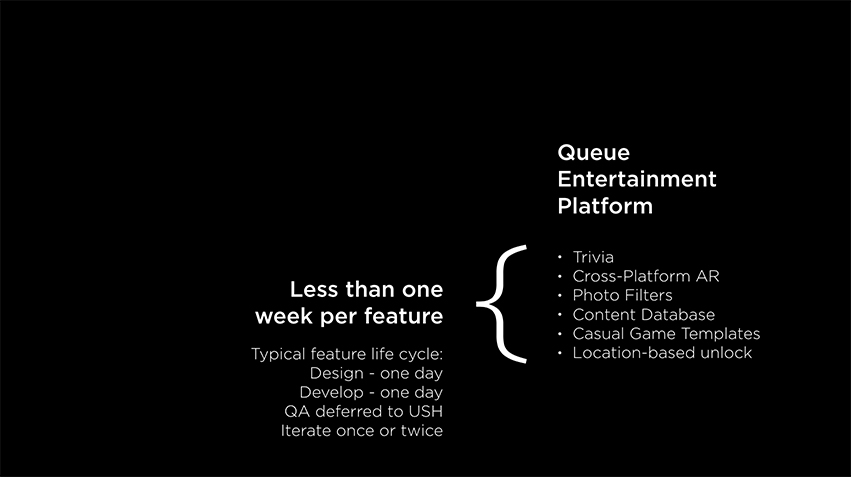
Slide from my post-mortem presentation highlighting schedule and resource challenges
The Design
HHN Hollywood is an event at Universal Studios Hollywood centered around 10 haunted houses, each house using different licensed IP from popular horror film franchises. Our app was designed for guests who were waiting in the queues for these houses, so given the tight schedule our mission was clear: create reskinnable templates for each feature in the app, then reuse each template across all ten queues at HHN. By eliminating as many unique designs as possible which would only be applicable to a single queue, I felt that it was possible to achieve an app that would feel complete by the end of our 8 week schedule.
An early design prototype by one of our contractors
Neither the Universal marketing team nor our team at Media Labs had a designer on staff, and when I asked, I was was told that we did not have budget for project hires. After a few days of design prototyping with our small team of 3, Media Labs leadership decided that I would hold dual responsibilities as lead designer and lead programmer for the app, which was not an ideal situation.
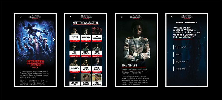
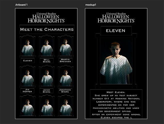
Some of my final designs for the Stranger Things queue
With such a tight schedule, I knew I had to make some fast design decisions and switch our small team into development mode. My design goal was simple: get the app UI out of the way of the content as much as possible. Where I had key art, I made it full screen. UI elements were mostly flat with rounded corners, monochromatic where possible, and kept to a minimum.
Where we did need UI elements, I started with a color scheme of black, red, and white to match Universal's HHN Logo, and heavily relied on black-to-transparent gradients to blend between sections of the screen. The resulting look and feel was pleasantly spooky in some places, but I wish Media Labs had invested more in the product design.
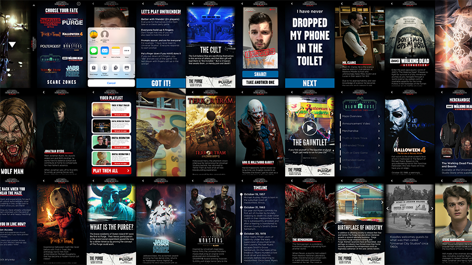
In total I designed and implemented about 130 screens for the app in 63 days
The Purge
One of the highlights of this project was working with the USA design team on The Purge section of the app. USA had worked out a deal with Universal in which USA would design all the screens for The Purge, and I would implement the USA designs. The USA design team had so many great ideas, and were wonderfully collaborative partners when we ran into technical/time limitations. As a result, The Purge was the best section of the app.
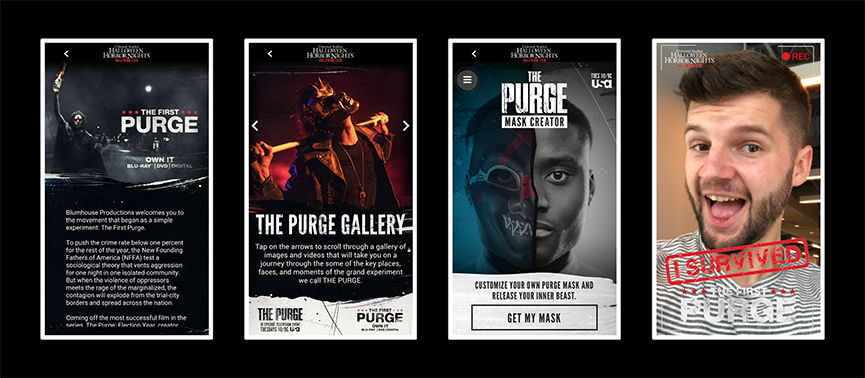
Some screens from The Purge section, designed by USA and implemented by me
The Implementation
Given our schedule constraints, our workflow at Media Labs was to prototype designs directly in Unity. I chose to decouple each view from the corresponding art assets using a layer of ScriptableObjects; this way, if Universal or any of our partners did not approve a design, we could quickly build new views without changing the underlying data model. Each view made use of Unity's "nested prefabs" feature which was in beta at the time, allowing us to easily reuse UI elements across the app like headers, text boxes, and buttons.
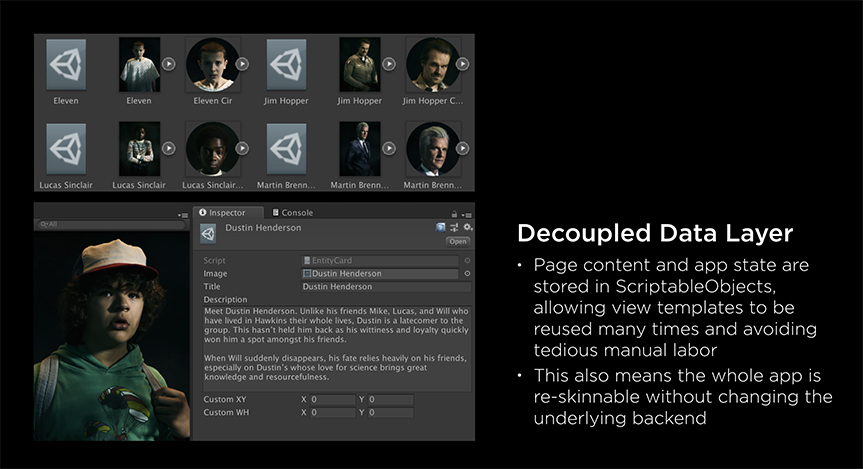
Slide from my post-mortem presetation highlighting separation of view and data model
The Test Plan
Starting in mid-August, I distributed daily builds to about a dozen stakeholders at Universal and USA via HockeyApp (now the Microsoft Visual Studio App Center). Distributing the Quality Assurance (QA) process across all available team members was critical, and were able to fix most bugs and get some great early feedback from our stakeholders during this time.
By early September, we were distributing beta builds via TestFlight to 200 Universal Team Members. In beta, we discovered some challenging UI scaling issues with older iPhone models and the brand new iPhone XS Max, which was released on September 21. Because Media Labs had already maxed out all our available resources toward content production, the QA overhead unfortunately caused us to miss our planned launch date.
We launched on September 29 thanks to a quick App Store review from Apple, and then in the Google Play store shortly afterward. Development continued through mid-October with one major content update to try a couple new gameplay ideas.
The Post-mortem
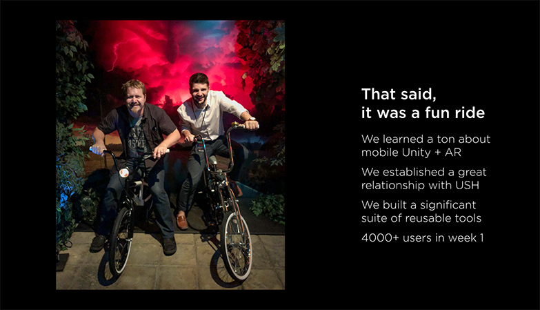
We acquired about 30,000 unique users during the event, and achieved our goal of learning from that audience through some awesome data analytics dashboards that my teammates integrated. During my post-mortem presentation, I made the following recommendations to the Media Labs leadership team based on my experiences:
- Explicit Requirements
- Universal and Media Labs had not drafted a scope of work when they started the project, resulting in costly misalignment and ultimately feature cuts from the app as deadlines drew nearer
- Schedule Based on Observed Velocity
- The Media Labs leadership team wasn't aware that the project was already behind schedule before I joined the team, so I encouraged them to measure the velocity of their development teams using a traditional scrum poker planning technique and plan their future product development schedules accordingly
- UI Prototyping (do it)
- The absence of a true designer for most of the app was painful, and ultimately our client suffered the most as a result. By the time Universal had their hands on builds of features, design feedback had to be actionable within a single day in order to keep the app on schedule. This limited Universal's ability to express their design intent for the app
- QA (have a plan)
- I recommended that Media Labs secure funding for a QA firm before they took on any future mobile app development. Our small team did not have the resources to ship a product on time without that level of support
Final slide from my post-mortem presentation